Email Plain Text vs HTML Which Format Wins for Engagement
- Guy Williams

- Jan 8
- 15 min read
Updated: May 11
When it comes to email, the whole plain text vs. HTML debate is a bit of a red herring. The real conversation isn’t about which format is “better,” but which one is right for the specific job you’re trying to do.
Think of it this way: plain text emails feel like a personal note from a real person. They’re fantastic for building one-on-one connections, especially with behavior-based automations. On the flip side, a visually rich HTML email is your go-to for grabbing attention, driving sales with big promotions, and telling your brand’s story in a compelling way.
Choosing Your Email Format for Shopify Growth
Deciding between plain text and HTML isn't just about aesthetics; it's a strategic move that directly impacts your Shopify store's bottom line. Each format plays a unique role in the customer journey, and knowing when to deploy each is key to running a successful email program.
A simple way to frame it is to see HTML emails as your digital storefront—perfect for broadcasting sales and showcasing products. Plain text, however, is like a personal note from the founder, designed to build trust and recover potentially lost sales.
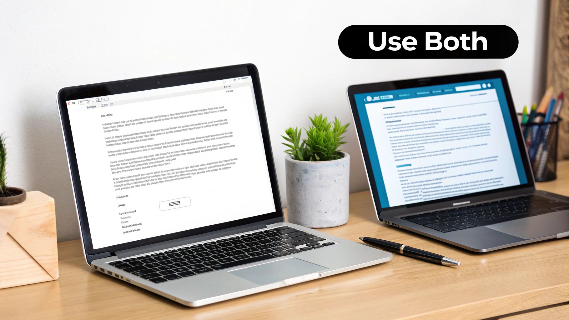
The smartest strategy is a hybrid one that uses both. You get the high-impact visuals of HTML for your big promotional blasts without losing the authentic, personal feel of plain text for those crucial relationship-building moments. As we dig into the differences, always remember to match the format to your message’s intent. For a broader look at how this fits into a complete strategy, see our ultimate guide to Shopify email marketing in 2025.
Quick Comparison Plain Text vs HTML Emails for E-commerce
To make the choice easier, let's look at how these formats line up with common e-commerce goals. The right format should always be driven by what you want the customer to do next. A cart recovery email, for example, works best as a gentle, personal reminder—making plain text the obvious choice. But a Black Friday announcement needs to create a buzz and show off products, a job that HTML was built for.
The most profitable Shopify stores don't pick a side in the email plain text vs HTML debate. Instead, they master both, deploying visually stunning HTML for sales and simple plain text to build authentic customer relationships that drive long-term value.
This table gives a high-level summary of when to use each format depending on what you're trying to achieve with your marketing.
Use Case | Recommended Format | Primary Goal |
|---|---|---|
Welcome Series & Onboarding | Hybrid (Minimal HTML) | Build trust and guide first purchase |
Cart & Checkout Recovery | Plain Text or Personal HTML | Overcome hesitation and recover sale |
Promotional Campaigns & Sales | HTML | Drive clicks and showcase products |
Winback & Re-engagement | Plain Text | Re-establish personal connection |
By matching the email format to your campaign's goal, you create a more effective and cohesive experience for your customers. This alignment translates directly into better engagement and, ultimately, more sales for your Shopify store.
Understanding the Fundamental Format Differences
To build a winning email strategy, you first have to get a handle on the tools you're working with. The choice between email plain text vs HTML isn't just about aesthetics; it fundamentally changes how your message gets built, delivered, and ultimately, how your customers experience it.
Think of a plain text email as a modern-day typewritten letter. It’s just words on a screen—no images, no fancy fonts, no clickable buttons, and certainly no brand logos or colors. Its real power lies in this simplicity. Every single email client on any device can display it perfectly, every time. The focus is squarely on your message, which can make it feel incredibly direct and personal.
On the other hand, an HTML (HyperText Markup Language) email is essentially a mini-webpage that lands straight in someone's inbox. This format uses code to let you create a rich, visual experience. You can drop in product images, use brand fonts and colors, arrange content in columns, and design vibrant call-to-action (CTA) buttons that tell subscribers exactly what to do next.
The Technical Foundation
The core difference is all in the encoding. Plain text is as straightforward as it gets, using a basic character set that every device understands. This makes it lightweight, fast, and removes all the variables that could trip up how your email looks.
HTML is a different beast entirely. It needs the recipient's email client to read its code and then "render" the design you intended. This is where things can get tricky. Clients like Gmail, Outlook, and Apple Mail all interpret HTML slightly differently. That's the frustrating reason why your perfectly crafted email might look beautiful in one inbox and completely broken in another.
This rendering variability is a key reason why plain text often feels like the safer bet. It guarantees a consistent experience for everyone, while HTML aims for a branded, visual impact that demands rigorous testing across platforms.
What Is Multipart MIME?
So, how do modern email platforms like Email Wiz bridge this gap? They use a smart solution called Multipart MIME (Multipurpose Internet Mail Extensions). This technology cleverly bundles both the plain text and the HTML versions of your email into a single send.
When your email lands in the inbox, the recipient's email client automatically picks the best version to show.
If the client supports HTML and the user has it enabled, they see your beautiful, branded version.
If the client is a simple text-based reader, a smartwatch, or if the user has disabled HTML for security reasons, the clean plain text version appears instead.
This fallback system is a game-changer. It makes sure your message always gets through, no matter what tech your subscriber is using. By sending multipart emails, you’re covering all your bases, maximizing deliverability without forcing a one-size-fits-all approach. Knowing this is key—it shows the debate isn't about picking one format over the other, but about using a system built to deliver the best of both worlds.
How Email Format Impacts Performance and Deliverability
Choosing between plain-text and HTML emails isn't just about aesthetics; it’s a strategic move that can make or break your campaign's profitability. The way an email is coded and designed directly impacts whether it lands in the primary inbox, how many customers engage with it, and ultimately, whether they buy from you. The goal isn't to declare a single winner but to know which format to deploy for the right campaign at the right time.
At the end of the day, every Shopify merchant wants the same thing: for their emails to be seen, opened, and clicked. Let's dig into how your format choice affects each of these critical steps.
Inbox Placement and Deliverability
Before your email can convert a customer, it has to get to them. This is the first hurdle, and it's where plain-text emails often have a natural edge. Email clients like Gmail and Outlook are inherently skeptical of emails loaded with complex code, tracking scripts, and heavy image files—all common traits of spam.
A plain-text email is simple by design. It's lightweight and clean, stripped of the potential red flags that trigger spam filters. This simplicity gives it a much better shot at avoiding the dreaded promotions tab and landing directly in the primary inbox. For e-commerce brands, just getting seen is half the battle, and simplifying your format can seriously boost your odds. If you want to take a deeper dive, check out our guide on how Shopify merchants can improve email deliverability.
Open Rates and Initial Engagement
Once your email arrives, the next challenge is getting it opened. While slick HTML emails can use eye-catching branded headers and preview text, plain-text emails have a secret weapon: authenticity. An email that looks like it was personally typed out by a real person stands out in an inbox crowded with glossy, impersonal promotions.
This one-to-one feel can be a game-changer for open rates. When a subject line feels genuine and the sender is a person's name—like "Sarah from [Your Brand]"—it feels less like a marketing blast and more like a real conversation. That builds curiosity and trust, which gets you the open.
The best plain-text emails don't feel like they were sent to a list of thousands. They feel like they were written for one person, and that's an incredibly effective way to cut through the noise.
Click-Through and Conversion Rates
This is where the debate gets really interesting. On paper, HTML should win every time. It lets you showcase products with stunning images, use big, bold call-to-action (CTA) buttons, and visually guide the reader's eye toward a purchase. For a flash sale or a new product drop, a visually rich email is almost always the right call.
But the data tells a different story. In many head-to-head tests, simpler emails actually outperform their highly-designed counterparts on key engagement metrics. Benchmark Email found that plain-text emails can see 21% higher click-to-open rates and 17% higher click-through rates than HTML versions. For a Shopify store with a 10,000-person email list, that's hundreds of extra clicks from the exact same send.
So, what's going on here? The focused, distraction-free nature of a plain-text email can make a single, clear link incredibly compelling. Instead of being overwhelmed by multiple images, buttons, and sections, the subscriber’s attention is laser-focused on one primary action. This can, paradoxically, lead to more clicks in specific campaigns like cart recovery or win-back flows where the goal is a single, clear action.
Why Simplicity Often Wins the Inbox Placement Battle
Deliverability is the invisible engine of email marketing. If your emails don't land in the primary inbox, nothing else matters—your open rates, your click-throughs, your sales. It’s a wasted effort. And one of the biggest factors in that fight for inbox placement is surprisingly simple: your email's format. The plain-text vs. HTML debate gets really serious here, because it directly impacts whether your customers ever see your message.
Think of inbox providers like Gmail and Outlook as incredibly smart bouncers at an exclusive club. They’re constantly scanning every email trying to spot trouble. Their algorithms look at hundreds of signals to weed out spam, and unfortunately, many of the red flags are built right into complex HTML designs.
Emails loaded with heavy code, multiple tracking scripts, and oversized image files can set off alarm bells. These elements make an email "heavier" and more complicated, which often looks a lot like the spam and phishing emails their filters are designed to block. The result? Your beautifully designed, totally legitimate marketing email gets exiled to the spam folder or buried in the promotions tab.
The Code Bloat and Deliverability Problem
Imagine your email's code is a package going through customs. A small, lightweight box—your plain-text email—sails right through. But a huge, clunky crate with a bunch of weird compartments—your bloated HTML email—is going to get pulled aside for a full inspection.
Every extra line of code, every massive image, and every third-party tracking pixel adds bulk. This "code bloat" doesn't just make your email load slower; it makes it look riskier to inbox providers.
The rule of thumb is pretty clear: the less a spam filter has to analyze and question, the better your chances of hitting the primary inbox. Simplicity signals authenticity.
This isn't to say all HTML is evil. A well-coded, lightweight HTML email can do wonders. The trouble starts when templates get stuffed with so many design flourishes that they hurt your deliverability more than they help your brand.
The Tangible Cost of Poor Inbox Placement
A dip in your inbox placement rate isn't just a number on a dashboard; it hits your bottom line. Hard. For any growing Shopify store, even a small fraction of emails missing the mark means leaving real money on the table.
Let’s put some numbers on it. Research from MailMonitor consistently shows that plain-text emails see better inbox placement because they don't have all the elements that can trigger spam filters. They classify plain text as a "low" spam risk, whereas HTML’s risk level climbs with every added design element. For a store sending 100,000 promotional emails, a 5-10% drop in inbox placement from a heavy HTML template means 5,000 to 10,000 people never even get the chance to see your offer. This detailed comparison of deliverability factors really breaks down how the formats differ.
This loss of reach creates a painful domino effect:
Fewer Opens: If it’s not in the main inbox, it’s not getting seen.
Lower Clicks: No opens means no clicks on your call-to-action.
Lost Revenue: Ultimately, it all leads to fewer sales and a weaker ROI on your email efforts.
By sticking to cleaner formats—whether that's pure plain text for those personal-touch automations or a minimalist HTML for your promos—you’re actively building a stronger sender reputation. You're giving every single campaign its best shot at landing right where you want it: directly in front of your customer.
Strategic Email Formats for Shopify Stores
Knowing the difference between plain-text and HTML emails is one thing. Knowing exactly when to use each to actually make money for your Shopify store is a completely different ballgame. The best email strategies don't take a one-size-fits-all approach; they match the email's design to its specific job in the customer's journey.
For your most important automated flows—like welcome series and cart recovery—the format you choose can be the difference between a completed purchase, a return visit, or your message getting completely ignored. Let’s look at the most common email scenarios for a Shopify store and pick the winning format for each.
Cart and Checkout Abandonment: The Personal Nudge
When a shopper leaves items in their cart, it’s usually a moment of hesitation, not a hard "no." A flashy, heavily branded HTML email can feel a bit aggressive here, almost like a salesperson shouting from across the room. The goal is to gently remind and offer help, not to push a hard sell.
This is where a plain-text or minimalist HTML email absolutely shines. An email that feels like it was personally typed up by someone on your team can be incredibly effective. It reads like a genuine, one-to-one conversation, which does a much better job of breaking down that purchase barrier than a glossy promotion ever could.
Recommended Format: Plain Text or a minimalist "hybrid" HTML.
Why It Works: It feels personal and authentic, cutting right through the clutter of typical marketing emails.
Example Tone: "Hi [Customer Name], I noticed you left a few items in your cart. Did you have any questions I can help with? - Sarah, Founder"
Product Launches and Weekly Newsletters: The Visual Showcase
On the flip side, when you need to build excitement and drive sales right now, visuals are everything. For new product launches, big seasonal sales, or your weekly newsletters, a visually rich HTML email is the only way to fly. You have to show off your products with high-quality photos, use eye-catching call-to-action buttons, and keep your branding front and center.
Even with all the talk about plain-text deliverability, HTML is still the undisputed champion for campaigns where clicks and conversions are the main goal. Analytics consistently show that clickable buttons and product grids are crucial for guiding a shopper from their inbox to your checkout page.
For brand storytelling and promotional campaigns, HTML isn’t just an option—it's a necessity. It transforms your email from a simple message into an extension of your online store, creating a powerful and persuasive shopping experience.
Welcome Series: The Hybrid Handshake
A welcome series has two jobs: introduce your brand and nudge new subscribers toward their first purchase. A hybrid approach works beautifully here.
The very first email can be a simple, text-focused message from the founder to forge an immediate, personal connection. Then, the next emails in the series can gradually introduce more HTML elements—showcasing your best-sellers, using lifestyle images to tell your brand story, and offering a clear discount with a big, bold CTA button. This approach builds trust before you go in for the sale.
Post-Purchase and Win-Back Campaigns: The Relationship Builders
After someone buys from you, your goal shifts from conversion to retention. A plain-text "thank you" from the founder or a simple check-in message a few weeks later can build incredible loyalty. It proves you care about their experience, not just their credit card number. While this guide focuses on Shopify, the strategic thinking behind email formats is universal, a concept also explored in these B2B email marketing strategies.
The same logic applies to win-back campaigns trying to re-engage lapsed customers. Another polished HTML promo might get ignored just like the last one. But a personal, plain-text note asking, "Hey, we miss you. Is there anything we can do better?" can be just the thing to reignite that relationship and bring a valuable customer back. By picking the right format for the right moment, you turn your email channel into a smart, revenue-driving machine.
How to Test and Implement Your Email Strategy
So, you've got the theory down. Now it's time to put it into action, because that’s how you’ll actually see growth for your Shopify store. The only way to truly settle the email plain text vs html debate for your specific audience is to test both formats. A simple, well-structured A/B test will give you hard data instead of forcing you to rely on someone else's assumptions.
A great place to start is with one of your most important automated flows: cart recovery. This scenario is perfect for testing. Why? Because it has a single, crystal-clear goal—getting that sale back. You can set up an easy split test where 50% of shoppers who abandon their carts get a simple, personal-looking plain-text reminder. The other 50% will receive a clean, minimalist HTML version that includes the product image and a bold call-to-action button.
Setting Up Your A/B Test Framework
You don't need a bunch of complicated tools to run a test like this. Most modern email platforms, including our own Email Wiz, have A/B testing features built right in. Of course, picking the right platform is a critical part of your strategy. Many Shopify store owners find themselves comparing Shopify Email vs Klaviyo to see how each one handles different email formats and testing capabilities.
Here’s a simple framework you can follow:
Isolate One Variable: This is the golden rule of testing. The only thing that should be different between your two emails is the format—plain text vs. HTML. Keep the subject line, the core message, and the sending time exactly the same. This ensures you're only measuring the impact of the format itself.
Define Your Success Metrics: Know what you're measuring before you hit "send." For a cart recovery test, the most obvious metrics are your click-through rate (CTR) and, the one that really matters, recovered revenue.
Run the Test Long Enough: Don't jump to conclusions after a day. Let your test run until you have a statistically significant sample size. For most stores, that means letting it go for at least one or two weeks, or until a few hundred people have gone through the flow.
Interpreting Your Test Results
Once your test is over, digging into the results is pretty straightforward. It's tempting to fixate on open rates, but you need to look at the numbers that actually affect your bottom line. You might discover that the plain-text email gets a slightly higher open rate because it feels more personal. But maybe the HTML version gets more clicks and brings in more revenue because its visual call-to-action is impossible to miss.
The point of testing isn't to declare one format the "winner" for all your emails. It's about understanding how your audience behaves in different situations. A customer might love a personal plain-text nudge about their abandoned cart but respond way better to a visually stunning HTML email announcing a new collection.
Drilling down into these key metrics is how you get better. You can learn more about how to boost your click-through and open rates with key metrics and tips in our detailed guide.
This cycle of constant testing and tweaking is what separates a powerhouse email program from one that’s just going through the motions. Use what you learn to build a smart, balanced strategy—one that uses the strengths of both plain-text and HTML emails to keep your customers engaged and drive sales at every stage.
Got Questions? We've Got Answers
When you're deciding between plain-text and HTML emails for your Shopify store, a few common questions always pop up. It's easy to get stuck on the details, so let's clear up the biggest ones right now.
Getting these fundamentals right will help you build a smarter, more flexible email strategy that actually gets results. Think of it this way: each format is a tool, and knowing exactly when and how to use it is what separates the pros.
Can I Still Track Clicks in a Plain-Text Email?
You sure can. It’s a common misconception that plain-text means zero tracking. While you do lose the invisible pixel that tracks open rates, click tracking works just fine.
Here’s how: your email service provider automatically wraps any link you include in a special tracking URL. When a customer clicks it, they’re momentarily redirected through the provider's server—which logs the click—before landing on your site. This means you can still measure engagement and see exactly how much revenue your plain-text emails are generating.
Will Using Plain-Text Emails Hurt My Branding?
Not a chance. In fact, it can actually help your branding, just in a different way. HTML emails are great for showing off your visual brand with logos, fonts, and colors. Plain-text emails, on the other hand, are all about your brand's voice.
A well-written, personal-sounding email makes your brand feel more human, authentic, and approachable. This is a huge advantage for automations like a win-back series or a personal check-in after a purchase, where a genuine connection can build more loyalty than a slick, corporate-looking template ever could.
Think of it like this: HTML builds visual brand recognition, while plain text builds conversational brand trust. Use them together, and you've got a much more powerful and complete brand experience.
Which Email Format Is Better for Accessibility?
Plain text wins here, hands down. It's inherently accessible and works flawlessly with screen readers and other assistive technologies right out of the box—no extra work required on your end.
HTML emails can be made accessible, but it takes deliberate effort. If you go the HTML route, you need to be mindful of a few things:
Use semantic HTML, like proper heading tags, so screen readers can navigate the content.
Write descriptive alt text for every single image.
Make sure your text and background colors have enough contrast to be easily read.
If you don't build them correctly, complex HTML designs can be a nightmare for subscribers with disabilities. The best practice is to always send what's called a "multipart MIME" email. This simply means your email includes both an HTML and a plain-text version, and the recipient's email client will automatically show the one that works best for them. Everyone gets the message, no matter what.
Plain Text vs HTML Email: Conclusion
Ready to implement a powerful, automated email strategy without the complexity? Email Wiz sets up your entire Shopify email channel in 30 seconds, from welcome series to cart recovery, all powered by AI. Join over 10,000 brands and see how easy it is to drive revenue at https://emailwiz.ai.


Comments