HTML or Plain Text Email Which Format Wins for Shopify?
- Redoy shaikh
- Dec 15, 2025
- 13 min read

When it comes to choosing between HTML and plain-text emails, the smartest strategy isn't about picking a winner. It's about using both. Think of them as different tools for different jobs.
HTML emails are your visual powerhouse, perfect for eye-catching promotions. In contrast, plain-text emails are masters of personal connection, cutting through the noise and ensuring your message actually lands in the inbox. The right choice always comes down to what you're trying to achieve with a specific campaign.
The Definitive Answer HTML or Plain Text Email
For Shopify merchants, the best way to approach this is to stop thinking about it as a technical choice and start seeing it as a strategic one. It's a core part of effective email marketing. HTML emails let you create beautiful, on-brand experiences that feel like an extension of your store—essential for product launches or big sales where visuals do the selling.
Plain text, on the other hand, feels like a message from a real person. It's simple, direct, and builds a sense of authenticity that's incredibly effective for follow-ups, asking for reviews, or re-engaging a quiet customer.
The secret weapon here is the hybrid approach. Modern email tools send a "multipart" message containing both versions. The subscriber's email client then automatically displays the best format for them. This gives you the visual punch of HTML, which drives impressive 26.6% open rates, combined with the rock-solid inbox placement of plain text.
Quick Decision Guide HTML vs Plain Text Emails
If you're in a hurry, this quick guide breaks down the core strengths and ideal scenarios for each format. It’s a great starting point for planning your next campaign.
Factor | HTML Email | Plain Text Email |
|---|---|---|
Primary Goal | Drive sales, showcase products, and promote brand identity. | Build relationships, improve deliverability, and ensure accessibility. |
Best Use Cases | Product launches, promotional sales, welcome series, newsletters. | Personal follow-ups, re-engagement campaigns, transactional alerts. |
Key Strengths | Visual design, branding, click-through tracking, engagement metrics. | High deliverability, fast loading, personal feel, universal compatibility. |
Main Weakness | Can be flagged by spam filters; may render poorly on some devices. | No visual elements, limited tracking, and less brand expression. |
Ultimately, having both in your toolkit allows you to adapt your communication style to the message, the audience, and the goal.
Analyzing Email Performance Across Key Metrics
Choosing between an HTML or plain-text email isn't just about how it looks. It's a strategic decision that ripples through all of your core marketing metrics. What good is a stunning HTML email if it gets flagged as spam? On the flip side, a plain-text email that never encourages a click isn't doing its job either.
To make the right call, we need to look at how each format performs at every step, from hitting "send" to getting that final conversion.
The First Hurdle: Deliverability
The very first test your email faces is getting into the inbox. Internet Service Providers (ISPs) and their spam filters are the gatekeepers here, and they're constantly on the lookout for anything suspicious.
Because HTML emails are built with code, they naturally attract more scrutiny. Shoddy coding, too many images without enough text, or certain trigger words can get your campaign sent straight to the junk folder. It's a common pitfall for marketers who aren't careful.
Plain-text emails, however, are as simple as it gets. With no code to analyze, spam filters see them as far less of a threat, often giving them a better shot at landing in the primary inbox. This is especially true if you're emailing subscribers at companies with strict security, like those in finance or government.
Dissecting Engagement Metrics
Once you're in the inbox, the real work begins. This is where we look at open rates and click-through rates (CTR), and each format tells a different story.
You might be surprised to learn that plain-text emails can sometimes get higher open rates. Their stripped-down, personal feel cuts through the noise and feels less like a mass marketing blast.
But when it's time to get someone to take action, HTML almost always wins. Visuals are powerful persuaders. Branded colors, gorgeous product shots, and big, bold call-to-action (CTA) buttons are designed to catch the eye and make it incredibly easy for someone to click.
A study from Vero found that email campaigns with images saw a 42% higher click-through rate than those without. This really drives home how effective HTML can be at turning a reader's interest into a tangible click.
For a Shopify store launching a new collection, showing off the products with high-quality images in an HTML email will almost certainly get more clicks than a simple text link ever could. It’s all about finding that sweet spot between the personal touch that gets the email opened and the visual design that seals the deal.
Branding and User Experience
Every email you send is a reflection of your brand. HTML gives you total control, letting you weave in your logo, brand fonts, and color palette for a professional, cohesive experience. That consistency is what builds brand recognition and trust over time.
Plain text offers a completely different kind of user experience, one built on authenticity and directness. It feels like a genuine, one-on-one conversation. This approach is fantastic for building relationships, asking for a review, or sending a personal note from the founder.
To make this crystal clear, let's break down exactly how these two formats stack up against each other.
Detailed Feature Breakdown: HTML vs. Plain Text
This table gives you a side-by-side look at how each email type performs across the most important criteria for your marketing efforts.
Criterion | HTML Email Performance | Plain Text Email Performance | Recommendation |
|---|---|---|---|
Deliverability | Requires careful optimization. A good text-to-image ratio is key to avoiding spam filters. | Generally higher. The lack of code makes it less likely to be flagged by spam filters. | Start with HTML, but switch to plain text if you face deliverability issues. |
Open Rates | Can be lower if visuals push it into promotional tabs. Depends heavily on the subject line. | Often higher due to a more personal feel and better placement in the primary inbox. | Test both, but lean plain-text for relationship-building emails. |
Click-Through Rates (CTR) | Significantly higher. Visual CTAs, product images, and clickable buttons guide user action. | Lower. Relies entirely on great copy and hyperlinked text to get clicks. | Use HTML for any campaign where clicks are the primary goal (e.g., sales, new products). |
Branding | Excellent. Gives you full control to maintain a consistent visual brand identity. | Minimal. Branding is conveyed through the tone of your writing, not visual elements. | HTML is non-negotiable for building a strong, visual brand. |
Accessibility | Needs proper coding (like ALT text for images) to be usable for everyone. | Inherently accessible to all, including those using screen readers or on slow connections. | Always use ALT text in HTML, but plain text is the foolproof accessible option. |
After reviewing the differences, it's clear that your choice depends entirely on your campaign's goal.
Of course, none of this matters if your email never gets opened in the first place. A powerful subject line is the foundation for success, regardless of the format you choose. For a deep dive, check out our guide on email subject line best practices to boost your open rates. Nailing this first step is critical.
Making a Visual Impact: How HTML Emails Drive Sales
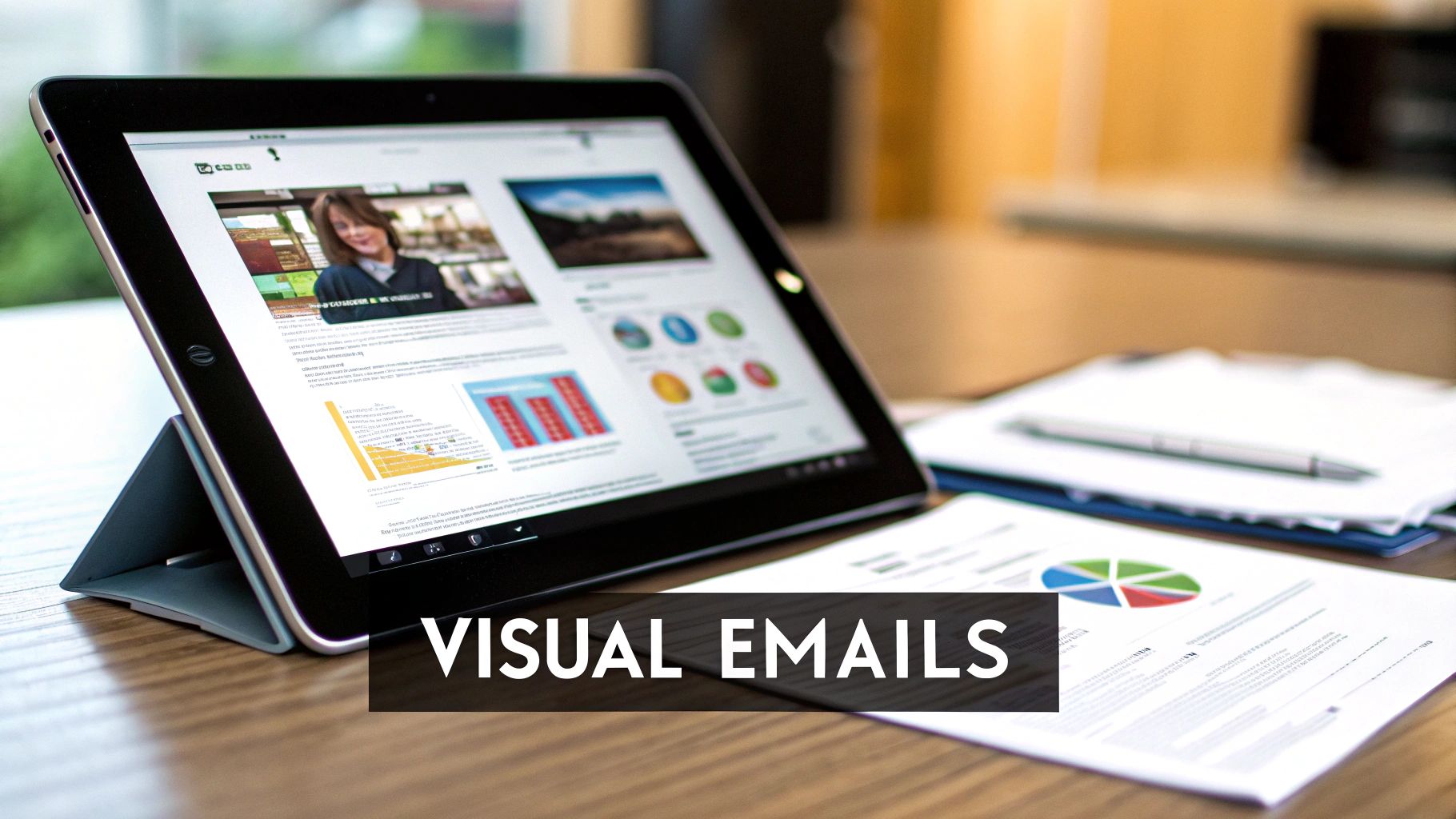
When your main goal is to drive sales and give subscribers a true taste of your brand, nothing beats an HTML email. For Shopify stores, these emails are like a mini-storefront delivered straight to a customer's inbox. You're not just sending a message; you're creating a rich, visual experience.
This is where you get to play with custom layouts, your brand's specific fonts, and that perfect color palette that customers recognize. It all comes together to build a professional, consistent look that fosters trust. But the real magic is in showing, not just telling. HTML lets you feature stunning product images, engaging GIFs, and interactive elements that just aren't on the table with plain text.
Guiding Customers from Inbox to Checkout
The biggest advantage of HTML is its power to direct a reader’s attention and encourage a click. A thoughtfully designed promotional email uses eye-catching product photos and bold, can’t-miss call-to-action (CTA) buttons to push click-through rates way up. That visual appeal is a direct line to better engagement and, you guessed it, more sales.
The numbers back this up. Global email open rates for HTML emails climbed to 26.6%, a noticeable jump year-over-year. It’s a clear sign that visually interesting designs do a better job of grabbing and holding attention.
To make sure your emails look fantastic for everyone, it's a good idea to optimize your visual HTML emails for various display settings, including dark mode.
Getting Smarter with Your Email Data
Beyond the pretty pictures, HTML emails provide a treasure trove of data that plain text simply can't offer. By including a tiny tracking pixel, you can measure open rates and finally see how well your subject lines are performing.
Data from HTML emails is what turns good marketing into great marketing. If you don't know who is opening your emails or what they're clicking on, you're just guessing.
HTML also lets you use click maps, which create a visual report of exactly where people are clicking. This insight is incredibly valuable for figuring out what your audience responds to. Are they clicking the first product image? Is that button at the bottom getting any love? Now you know.
This level of detail is what makes effective A/B testing possible. You can test different designs, headlines, and CTAs to see what really works, squeezing more value out of every send. For Shopify merchants using a tool like Email Wiz, this means you can pinpoint the visual tactics that rescue abandoned carts and bring customers back for more. Our guide shows you exactly how to create email templates that convert by putting this data into practice.
Building Trust with Simple Plain Text Emails
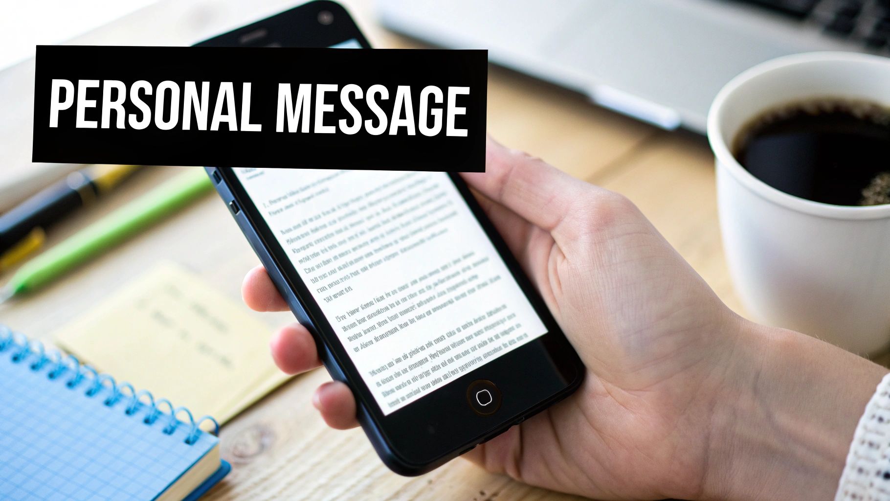
While flashy HTML emails are great for showcasing products, plain text has its own superpower: authenticity. Think about it. In an inbox overflowing with polished, branded promotions, a simple text-based message feels like a real conversation. It cuts through the noise and helps you build a genuine connection with your customers.
The biggest win here is deliverability. Plain text emails are lightweight. Without all the complex code and heavy images, they're far less likely to get snagged by spam filters or automatically shoved into the promotions tab. That means your message has a much better shot at landing in the primary inbox, where people will actually see it.
The Psychology of Simplicity
A plain text email looks and feels just like the messages people send to friends, family, and coworkers every single day. That familiarity instantly lowers a reader's guard, creating a sense of trust that heavily designed emails often struggle to match.
When a customer gets a plain text message, it doesn't scream "mass marketing blast." It feels personal and direct, making them far more likely to open, read, and even reply. This approach works wonders for specific situations:
Founder check-ins: A quick, personal note from the founder can do incredible things for brand loyalty.
Asking for reviews or feedback: A simple, direct request comes across as much more genuine and almost always gets a better response rate.
Re-engagement campaigns: A friendly "Hey, we miss you" message has a lot more impact when it feels like it came from a person, not a marketing bot.
We're seeing a big shift toward minimalism pay off for brands. Some recent case studies have shown open rates jumping from an average of 20% to as high as 60% just by switching from a slick HTML template to plain text. The reason? They’re dodging the promo filters and creating a sense of personal connection that makes people want to open the email.
Universal Compatibility and Accessibility
Another huge advantage of plain text is that it just works. Everywhere. It displays perfectly on every single device, email client, and even on smartwatches, guaranteeing a clean, fast-loading experience for everyone. No more worrying about broken images or wonky layouts.
This reliability makes it the go-to format for critical communications where you can't afford any confusion. Plus, for customers with visual impairments who use screen readers, plain text is completely accessible. It ensures your message gets to every single person in your audience, no barriers. These principles are fundamental to good communication, which we dive into deeper in our guide to transactional email best practices.
Matching Email Format to Your Customer Journey
Figuring out whether to use an HTML or plain text email gets a lot easier when you connect the format to a specific goal in your customer's lifecycle. There’s no single right answer for every email you send. The real magic happens when you align the message's purpose with the format's strengths, building automated flows that are both smart and personal.
This isn't just theory—it's about making every stage of the customer journey a chance to convert by picking the right tool for the job.
Crafting the Perfect Welcome Series
Your welcome series is your first handshake, so you need to make it a good one. This is the perfect place to mix and match email styles.
Email 1: The Brand Introduction (HTML): Lead with a visually rich HTML email. This is your chance to pull new subscribers right into your world with your logo, brand colors, and beautiful lifestyle photos. A strong visual hello cements your brand identity and makes that first interaction stick.
Email 2: The Personal Check-In (Plain Text): A couple of days later, switch gears with a simple plain-text email. A message that reads like a personal note from the founder or head of support feels incredibly genuine and builds instant rapport. Something as simple as, "Did you have any questions about finding the right product?" can spark conversations and create a real connection.
This one-two punch combines the "wow" factor of HTML with the trust-building power of plain text, creating an incredibly effective welcome for new subscribers.
Recovering Revenue with Abandoned Cart Flows
When a shopper leaves items in their cart, your objective is crystal clear and time-sensitive: get them back to finish the purchase. For this mission, visual persuasion is essential.
An HTML email is the undeniable winner for cart abandonment. It lets you dynamically pull in images of the exact products the customer left behind—a potent visual reminder of what they're missing out on. When you pair those images with a big, bold "Complete Your Order" button, you eliminate friction and make it incredibly easy for them to jump back in. Trying to describe a cart full of products in plain text just doesn't have the same immediate, action-driving punch.
A well-designed abandoned cart email is more than a reminder; it's a visual retargeting campaign delivered straight to the inbox. It uses the product's own appeal to reignite the desire that made them add it to the cart in the first place.
Re-Engagement and Feedback Requests
On the flip side, when you're trying to win back inactive customers or ask for product reviews, authenticity almost always beats a flashy design. A plain text email can slice through the promotional clutter that might have caused these subscribers to tune out.
A simple, personal-sounding message like, "Hey [Name], we haven't seen you in a while and wanted to check in," lands more like a genuine reach-out than a marketing blast. This low-key approach has a much better chance of getting opened and read, making it perfect for rekindling a relationship or asking for some honest feedback. For these goals, a conversational tone in plain text is your best move.
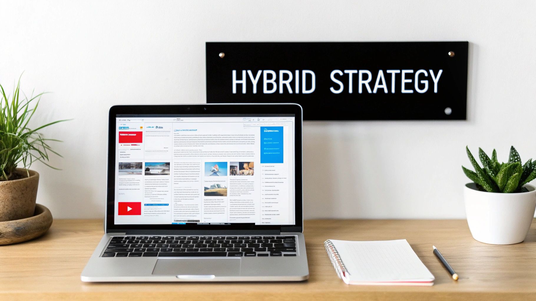
How to Use a Smart Hybrid Email Strategy
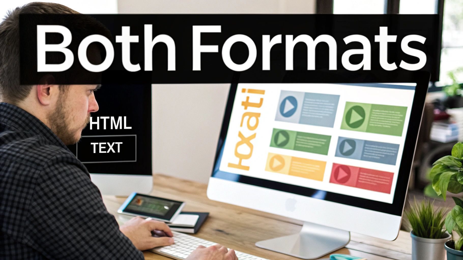
So, which should you choose: HTML or plain text? The best answer isn't to pick one over the other—it's to use both at the same time. This is done through a clever, behind-the-scenes standard called multipart MIME (Multipurpose Internet Mail Extensions).
Essentially, this approach bundles both the HTML and plain-text versions of your message into a single email. When it lands in someone's inbox, their email client (like Gmail, Outlook, or Apple Mail) automatically detects and displays the best-suited format. It’s a "best of both worlds" solution that’s already built into modern email platforms.
Why a Hybrid Approach Gets You Better Reach
This dual-format method acts as a critical safety net. What happens if a subscriber's email client blocks HTML for security reasons? Or if someone uses a screen reader and prefers a text-only experience for accessibility? In these cases, the plain-text version is displayed automatically. This ensures your message always gets through, no matter how the recipient is viewing it.
Using a multipart email isn’t just a nice-to-have anymore; it's the professional standard. It shows you respect user preferences, improves accessibility, and gives you a fallback that can make a real difference in your deliverability and engagement.
Email marketing platforms like Email Wiz make this completely seamless. While you’re busy designing a beautiful HTML campaign, the system is already generating a clean plain-text alternative in the background. You get all the visual impact of HTML without giving up the universal compatibility and inbox-friendly nature of plain text.
Ultimately, this means you never have to choose. You can design for maximum visual appeal and still have confidence that every single subscriber will receive a perfectly readable message. This approach takes the guesswork out of the equation and sets your campaigns up for success from the start.
Frequently Asked Questions
Can You Track Opens And Clicks In Plain-Text Emails?
This is a common question, and the answer is a bit of a "yes and no."
Open tracking is a no-go for pure plain-text emails. That little tracking pixel that tells you someone opened your message? It's a tiny image, which means it needs HTML to work. Plain text doesn't support images, so it can't track opens.
But what about clicks? Absolutely. Your email service provider, like Email Wiz, automatically converts your links into special tracking URLs. When a subscriber clicks one, they're quickly routed through a tracking server—which logs the click—before landing on the final destination page. Your reader never notices a thing.
Do HTML Emails Actually Hurt Deliverability?
Not inherently, but they can if you're not careful. Think of it this way: a clunky, image-only email with sloppy code looks suspicious to spam filters. It's often a red flag.
The key is to build clean, well-coded HTML emails that balance images and live text. More importantly, you should always send a plain-text version alongside your HTML email. This is standard practice, called a multipart MIME message, and it tells inbox providers you’re a legitimate sender, which can actually help your deliverability.
Which Format Should I Use For A/B Testing?
Both are fantastic for testing, they just let you test different things.
HTML emails are your playground for visual experiments. You can test button colors, different hero images, or even completely different layouts to see what gets the most engagement.
Plain-text emails put all the focus on your words. This is where you test your copywriting chops—try out different subject lines, opening hooks, or calls-to-action to see what truly persuades your audience.
One of the most powerful A/B tests you can run is pitting a full HTML design against a simple plain-text version of the same message. The results can be surprising and tell you a lot about what your specific audience really wants from you.
Ready to stop guessing and start growing? With Email Wiz, you can launch an entire professional email marketing program for your Shopify store in just 30 seconds. Try Email Wiz today and see how easy it is to drive more revenue.


Comments