Marketing Email Design: marketing email design for high-conversion results
- Redoy shaikh
- Dec 17, 2025
- 16 min read

Updated: May 12
Great email design isn't just about making things look pretty. It's a strategic blend of your brand's personality, a seamless user experience, and compelling communication, all working together to get your customers to take action. It’s about thoughtfully piecing together visuals, words, and calls-to-action to create an email that’s not only beautiful but also incredibly effective at hitting your business goals.
Why Your Marketing Email Design Is Your Silent Salesperson
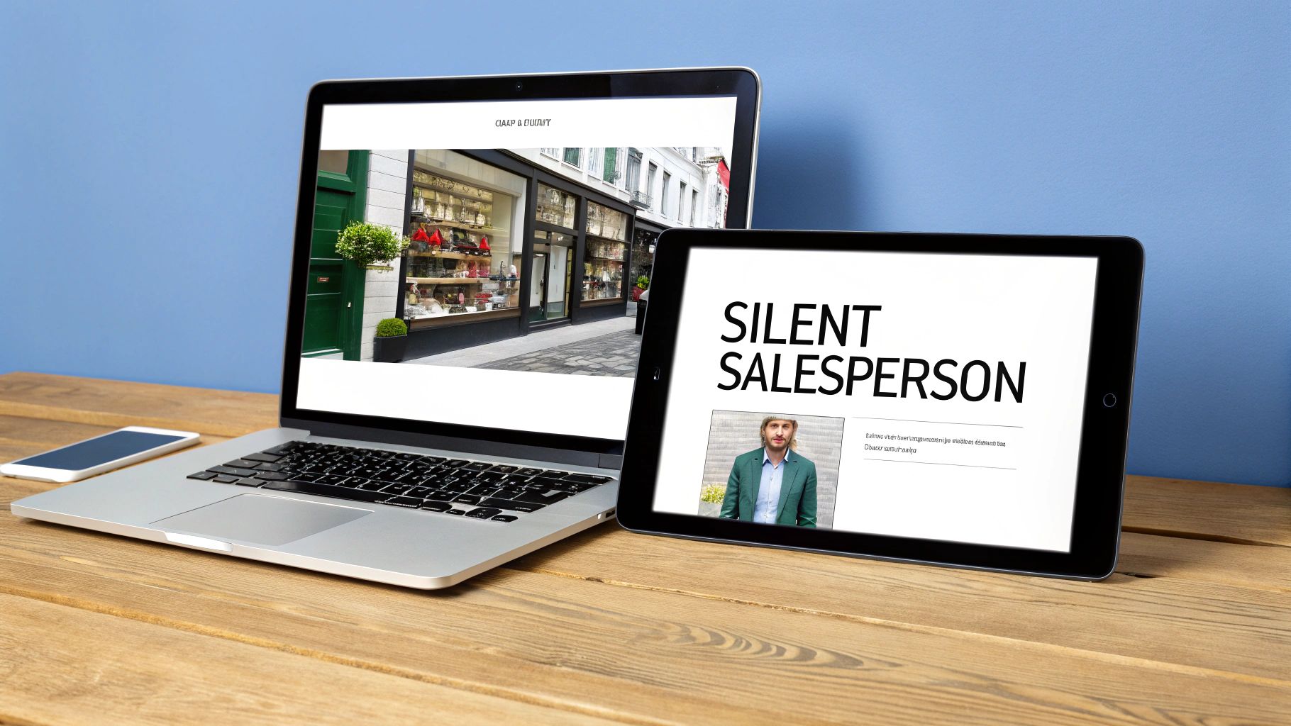
Picture your customer's inbox for a second. It's a crowded, noisy place. It’s a digital main street where hundreds of shops—emails from your competitors, newsletters they actually like, and messages from friends—are all shouting for their attention.
In this chaotic space, your email design is your storefront. A clean, professional, and inviting design is like a perfectly arranged window display; it makes people want to stop, look, and step inside. On the flip side, a cluttered, confusing, or poorly designed email is the equivalent of a neglected shop with a broken sign. It makes potential customers hurry on by without a second glance.
The real job of great email design is to guide your reader on a journey. It goes way beyond just slapping your logo and brand colors on a template. It’s about creating a clear, intuitive path from the moment they open the email to the second they click your call-to-action (CTA). Every single element, from the font size of your headline to the color of a button, has a job to do.
Directing Attention and Building Trust
Good design works its magic quietly in the background, building trust and directing your reader’s eyes exactly where you want them to go. When someone opens an email that looks and feels just like your website, it triggers a sense of familiarity and professionalism. That brand consistency is a powerful signal that they're in the right place, making them much more open to what you have to say.
This subconscious trust is everything. It chips away at the natural skepticism we all have toward marketing messages, paving the way for genuine engagement. Good design accomplishes this using a few key principles of visual hierarchy:
White Space: This is the breathing room in your email. It prevents the design from feeling cramped and overwhelming, allowing your most important elements to pop.
Contrasting Colors: Smart use of color instantly draws the eye to the most critical parts of your message, especially that all-important CTA button.
Logical Flow: The layout should tell a story, arranging content in a way that leads the reader naturally from one point to the next, ending at the desired action.
A well-designed email isn't just opened; it’s experienced. That experience is what removes friction between interest and action, turning a passive subscriber into an active, paying customer.
Think of it this way: your email design is your hardest-working salesperson. It’s on the job 24/7, presenting your brand in the best possible light, communicating your value, and making the path to purchase incredibly smooth. It’s the difference between an email that gets instantly deleted and one that drives real revenue, impacting your bottom line with every single send.
To put it all together, a high-performing email strategy rests on a few core pillars. This table gives you a quick snapshot of what we'll be diving into throughout this guide.
Core Pillars of High-Converting Email Design
This table summarizes the essential components of a successful marketing email design strategy, providing a quick reference for the key concepts covered in this guide.
Pillar | Objective | Key Impact Metric |
|---|---|---|
Brand Consistency | Build trust and immediate brand recognition across all touchpoints. | Customer Lifetime Value (CLV) |
Visual Hierarchy | Guide the reader’s eye to the most important elements, like the CTA. | Click-Through Rate (CTR) |
Mobile-First Design | Ensure a flawless experience on smartphones, where most emails are opened. | Open Rate & Conversion Rate |
Compelling Copy & CTA | Use clear, persuasive language that inspires immediate action. | Conversion Rate & Revenue/Email |
Accessibility | Make emails usable for everyone, including those with disabilities. | Audience Reach & Engagement |
Each of these pillars plays a crucial role in turning your email program from a simple communication channel into a powerful engine for growth.
Building a Cohesive Brand Experience in the Inbox
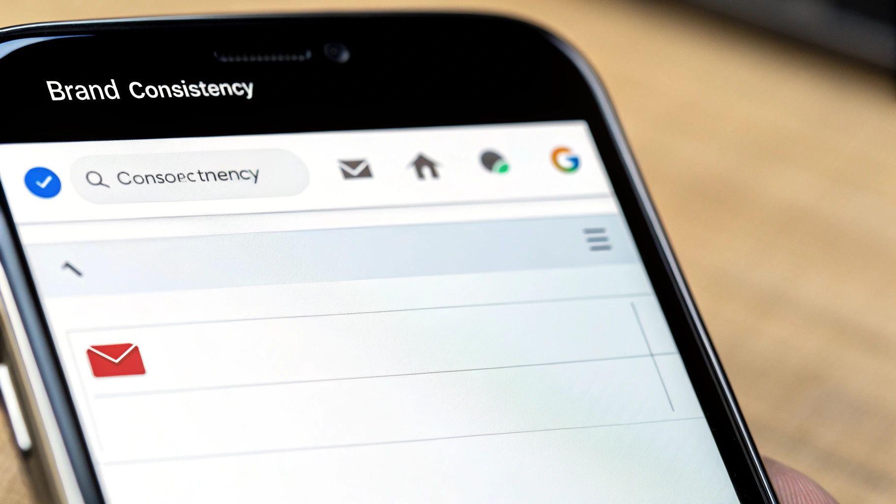
Before a subscriber even reads the first sentence, they should know the email is from you. That kind of instant recognition isn't magic; it's the result of smart, consistent branding that turns your emails into a familiar extension of your Shopify store.
Think of it this way: your brand identity is your store's personality. Your emails need to show up with that same personality, every single time.
When the colors, fonts, and logo in an email perfectly match what customers see on your website, it builds a powerful sense of trust. This familiarity smooths out the customer journey, lowering any subconscious skepticism and making people more open to what you have to say. It’s like spotting a friend in a crowded room—you instantly feel more at ease.
This is exactly why a solid, reusable email template is your secret weapon. It’s not just a time-saver. It’s about creating a predictable, reliable experience that builds brand loyalty with every email you send.
Crafting Your Brand-Consistent Template
Building a great email template is all about translating your core brand elements into a structured, recognizable layout. The aim is to create a framework that’s undeniably you but also flexible enough to handle everything from a flash sale announcement to your monthly newsletter.
Your template should be built around three key pillars:
Logo Placement: Your logo needs to be one of the first things a subscriber sees. Placing it right at the top, in the header, immediately anchors the email to your brand.
Brand Colors: Use your primary and secondary colors with purpose. A primary color is perfect for grabbing attention on headings and CTA buttons, while secondary colors can be used for backgrounds or subtle accents to keep things cohesive.
Typography: Don't go crazy with fonts. Stick to one or two that match your brand's vibe and are easy to read online. Use different font weights and sizes to create a clear visual hierarchy, making it obvious what’s a headline and what’s body text.
By locking these elements into a master template, you ensure every email strengthens your brand identity.
Designing Functional Headers and Footers
Your email's header and footer are prime real estate. They’re the bookends of your message, and keeping them consistent is absolutely crucial for building trust and making your emails genuinely useful.
A great template doesn't just look on-brand; it functions as a reliable mini-website within the inbox. Your header and footer are the primary navigation tools that make this possible, guiding users and building trust from top to bottom.
Keep your header clean and focused. Besides your logo, think about adding a simple navigation bar with links to key destinations on your Shopify store, like "New Arrivals" or "Best Sellers." This simple touch gives subscribers a direct path to shop and can seriously boost your click-through rates.
The footer is often an afterthought, but it’s a powerhouse of trust and utility. A well-designed footer should always include:
Social Media Links: Make it easy for subscribers to connect with you on other channels.
Contact Information: A link to your customer service page or even a physical address adds a layer of legitimacy.
Subscription Preferences: Give people clear options to manage their preferences or unsubscribe. This is non-negotiable for good deliverability and a healthy email list.
Brand Mission or Tagline: End with a short, memorable statement that reinforces what your brand is all about.
When you standardize these elements, your email stops being just a message and becomes a complete, cohesive brand experience.
Winning on Every Screen with Mobile-First Design
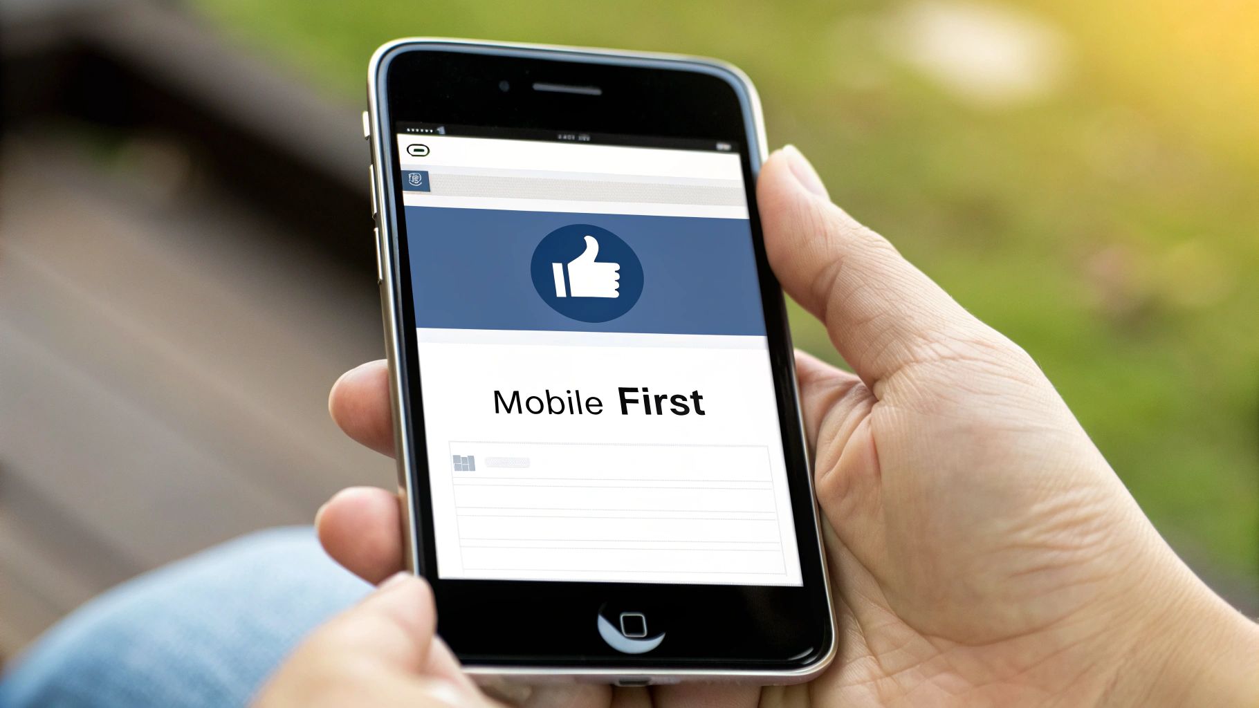
Let's be real: your customers aren't sitting at a giant desktop monitor waiting for your email. They’re scrolling through their inbox while waiting for coffee, browsing during their commute, or chilling on the couch. That small screen in their hand is the main stage for your marketing, which means a mobile-first approach isn't just a good idea—it's everything.
Thinking mobile-first is a total shift in philosophy, not just about making things smaller. Imagine building a house. You could build a sprawling mansion and then try to cram it onto a tiny plot of land. It’s awkward, cramped, and things will definitely break. That's designing for desktop first.
The mobile-first way is like starting with a smart, solid foundation that you can easily add rooms to later. It scales up perfectly, from phone to tablet to desktop. When you force a desktop layout onto a mobile screen, you create friction. Customers have to pinch, zoom, and awkwardly slide around just to read your message. That frustration leads straight to the delete button or, worse, an unsubscribe.
The Power of Single-Column Simplicity
The easiest and most effective way to nail mobile-first design is to embrace the single-column layout. It’s exactly what it sounds like: all your content—images, headlines, copy, and buttons—is stacked into one clean, vertical stream. It’s the native language of mobile, mirroring how we all scroll through apps like Instagram and TikTok.
This simple structure is a powerhouse for a few reasons:
Effortless Scrolling: People can glide through your entire email with an intuitive thumb swipe. No weird horizontal scrolling or missed content hiding off-screen.
Crystal-Clear Hierarchy: It forces you to be disciplined, presenting one clear idea at a time. This guides the reader's eye straight down the page toward your call-to-action.
Guaranteed to Work: A single-column layout always looks good. It naturally adapts to any screen width without breaking, from the smallest iPhone to the widest monitor.
This focused approach strips away the clutter and distraction, making your core message impossible to miss. It turns your email from a potential puzzle into a smooth, enjoyable journey.
Designing for Thumbs and Taps
On a phone, your customer's thumb is the new mouse. This completely changes how you need to design your buttons and links. A tiny text link that's a breeze to click with a precise cursor becomes a massive source of frustration for a thumb.
To create a truly thumb-friendly design, live by these rules:
Make Buttons Big: Your call-to-action buttons need to be large, obvious, and easy to tap. Aim for a minimum size of 44x44 pixels to give people a decent target.
Add Breathing Room: Surround your buttons and links with plenty of white space. This padding prevents those annoying accidental taps on the wrong element.
Choose Readable Fonts: Use a clean, simple font for your body copy that’s at least 16px. This ensures people can actually read your message without having to zoom in.
Adopting a mobile-responsive design is not just a best practice; it's a revenue driver. Launching a mobile-responsive email design boosts unique mobile clicks by a whopping 15%. This is critical in an era where Apple Mail commands 51.52% of the global email client market, making flawless cross-device compatibility essential. You can find more insights about email marketing statistics on hostinger.com.
Ultimately, a seamless mobile experience has a direct line to your bottom line. By designing for the smallest screen first, you cater to how the majority of your audience actually shops, cutting out friction and capturing sales that would otherwise be lost to a clumsy design.
Weaving Together Powerful Visuals and Persuasive Copy

Think of your email as a story. The visuals are the emotional hook that grabs your reader's attention, while the copy is the logical thread that guides them toward making a decision. When these two work in harmony, they create a single, compelling narrative that takes a subscriber from curious to convinced.
Powerful imagery—whether it's a gorgeous product shot, a relatable lifestyle photo, or a clever GIF—does more than just break up text. It stops the scroll in a crowded inbox, conveys a mood in an instant, and makes your products feel real and desirable. The copy then swoops in to add context, answer questions, and build a rock-solid case for why the reader needs what you're selling.
Choosing Visuals That Actually Sell
The right image can get your point across far faster than a paragraph ever could. For your Shopify store, every visual needs to be sharp, on-brand, and directly support the email's main goal. Your mission is to make them stop, look, and feel something.
Here are a few types of visuals that consistently perform well in ecommerce emails:
High-Quality Product Shots: This is table stakes. Use clean, well-lit images that show off your products from different angles or highlight their best features.
Lifestyle Photos: Show your products being used and loved in the real world. A photo of someone genuinely enjoying your product helps subscribers picture it in their own lives, forging a much stronger connection.
Animated GIFs: Use these to show a product in action, unveil a new collection, or just inject a bit of fun. They’re fantastic for drawing the eye exactly where you want it.
User-Generated Content (UGC): Sharing photos from happy customers is one of the most powerful forms of social proof. It builds instant trust and showcases your products authentically.
To produce great-looking visuals efficiently, you can even explore using AI images for marketing to streamline the creative process and keep your emails looking fresh. Just remember, the goal isn’t to decorate—it’s to communicate.
The data backs this up. In a world of 376.4 billion daily emails, those with compelling images see a 4.84% click-through rate (CTR). That completely overshadows the 1.6% CTR for text-only versions. When you consider the average email CTR is around 2-3.25%, that visual boost is a game-changer for hitting your revenue goals.
Writing Copy That Closes the Deal
Once your visuals have captured their attention, your words need to seal the deal. The best email copy is simple, direct, and laser-focused on the customer. It speaks their language and addresses their needs, making the decision to click feel like their own brilliant idea.
And remember, people don't read emails; they scan them. Structure your copy with short sentences, clear headlines, and bullet points to make it easy to digest.
A great email is a conversation. The visuals create the initial spark, but it's the persuasive, benefit-driven copy that builds rapport and guides the subscriber toward a confident 'yes.'
Try following this simple framework:
A Hooking Headline: This is the first bit of text they’ll actually read. Make it punchy, intriguing, and directly tied to your offer.
Benefit-Driven Body Copy: Don't just list features; sell the outcome. Instead of saying, "Our jackets have a waterproof coating," say, "Stay bone-dry on your next adventure." See the difference?
A Crystal-Clear Call-to-Action (CTA): This is the most critical piece of copy in the entire email. Use strong, action-oriented verbs like "Shop the Collection" or "Claim Your Discount." Never leave them guessing what to do next.
By pairing an emotionally charged image with clear, benefit-focused text, you create a powerful one-two punch that drives clicks and sales. For a deeper look at this, you might find our guide on https://www.emailwiz.ai/post/how-to-create-email-templates-that-convert helpful, as it covers how design and copy work together in more detail.
Using Personalization to Make Your Design Matter More
A stunning email design sent to the wrong person is just a beautiful failure. Think of it like a perfectly tailored suit on the wrong person—it might look great on the rack, but if it doesn't fit, it's not going to work. To really make your design connect with customers, you need to pair it with smart personalization and automation.
This is how you shift from shouting at a crowd to having a meaningful one-on-one conversation. It’s the difference between a generic flyer stuffed in a mailbox and a personal note from a helpful store clerk who knows exactly what you’re looking for. The result? Subscribers who feel seen, understood, and are way more likely to click.
Starting with Simple Personalization
The easiest way to get started is by using the customer data you already have. The most common tactic is simply addressing subscribers by their first name. Popping a tag into your subject line or the opening sentence of your email instantly makes it feel more personal and less like an anonymous blast.
But you can easily take it a step further with other info you collect:
Location-Based Offers: Got a subscriber's city or state? Use it to promote local store events, special in-store-only deals, or region-specific shipping offers.
Birthday or Anniversary Emails: A simple, automated email with a small discount on their birthday is a classic for a reason. It's an easy way to build goodwill and often drives a quick sale.
Past Purchase History: Recommend products that complement something they’ve already bought. If they just bought a new coffee machine from you, your next email could feature your newest blend of espresso beans.
These little touches show you're paying attention, which is the foundation of any strong customer relationship.
Powering Your Design with Dynamic Content
This is where your email design truly comes alive. Dynamic content lets you show different images, offers, and calls-to-action to different groups of subscribers, all within a single email campaign.
Imagine you sell men's and women's apparel. Instead of building two completely separate emails, you can design one that automatically shows your new women’s collection to your female subscribers and the new men’s line to your male subscribers.
Personalization isn't just a "nice-to-have" feature anymore; it's what customers expect. It ensures your carefully crafted design isn't just seen, but felt. It tells the subscriber, "This isn't for everyone; this is specifically for you."
This strategy goes way beyond gender. You could show different hero images based on what a customer was just looking at on your Shopify store. If someone spent five minutes browsing hiking boots, your next email could greet them with a stunning photo of those exact boots out on a trail. That level of relevance makes your design feel incredibly timely and work much harder for you.
Leveraging Automation and Behavioral Triggers
Automation is the engine that delivers your personalized, well-designed emails at the perfect moment. These automated emails, often called flows, are sent automatically based on a subscriber's specific actions (or sometimes, their inaction).
The data tells a clear story here. Personalized emails see 44.3% open rates compared to just 39.13% for generic campaigns. Even better, using segmentation can boost revenue by as much as 760%. To really dig into this, it helps to understand what is email segmentation and how it drives growth.
For Shopify stores, a few automated flows are non-negotiable:
Welcome Series: This is your first impression, triggered right after someone subscribes. Use it to tell your brand story, set expectations, and offer a compelling reason to make that first purchase.
Abandoned Cart Flows: When a shopper adds items to their cart but leaves without buying, an automated email showing them the exact products they left behind can recover a huge amount of lost revenue. This is an absolute must-have for any ecommerce store.
Post-Purchase Follow-ups: After an order, you can automatically send emails to say thanks, ask for a product review, or share helpful tips on how to use their new item.
If you want to create a truly memorable experience, you can even explore personalized video email marketing strategies within these flows. These automated, behavior-based emails can generate 10x more revenue than standard campaigns, which is why they're a cornerstone of any serious email marketing strategy.
Making Sure Everyone Can See—and Receive—Your Emails
You can craft the most beautiful email in the world, but it’s completely useless if it lands in the spam folder or if some of your audience can't actually read it. Before you hit send, your final pre-flight check needs to cover two crucial, deeply connected concepts: accessibility and deliverability. Getting these technical details right ensures all your hard design work actually pays off.
Think of accessibility as digital curb appeal. It’s about making sure people with disabilities, like visual impairments, can easily get the message you're sending. Simple habits here make a huge difference. For example, did you know that roughly 1 in 12 men and 1 in 200 women have some form of color vision deficiency? This makes something as basic as high-contrast color choices absolutely essential for readability.
How to Make Your Designs Accessible
Creating an inclusive experience doesn't have to be complicated. It really just comes down to a few good habits that should be baked into your email design process from the start. When you build these into your workflow, you guarantee that screen readers and other assistive tools can interpret your content correctly, opening your brand up to a wider audience.
Here are the non-negotiables:
Write Descriptive Alt-Text: Every single image needs alternative text (alt-text) that describes what's in the picture. This is what screen readers announce out loud, giving visually impaired subscribers the context they’d otherwise miss. Don't just label it "product_shot_1.jpg"; write something like, "A pair of red leather hiking boots resting on a rocky trail."
Use High-Contrast Colors: Make sure there's a clear, strong difference between your text and background colors. This simple step makes your copy legible for everyone, not just those with low vision or color blindness. There are plenty of free online tools that can check your contrast ratios for you.
Structure with Semantic HTML: Use proper heading tags (H1, H2, H3) to give your email a logical flow. This isn't just for looks; it creates a clear outline that screen readers can navigate, helping users jump to the information that matters most to them.
The Link Between Smart Design and Deliverability
Here's the kicker: all of these accessibility practices have a direct, powerful impact on whether your email even makes it to the inbox. Inbox providers like Gmail and Outlook use smart algorithms to filter out spam, and a poorly built email is a massive red flag. One of the oldest spammer tricks in the book is to send an email that’s just one giant image with no actual text.
Think of your email's code as its passport. Clean, accessible HTML with a good balance of text and images gets you through security smoothly. An image-only email with messy code is like a passport with missing pages—it’s going straight to the detention room (aka, the spam folder).
A healthy image-to-text ratio is key. When you use descriptive alt-text and have well-structured copy, you're sending strong signals to spam filters that your email is legitimate and provides real value. This is a big reason why it pays to understand the differences between email formats, a topic we dive into in our guide on HTML and plain-text emails for Shopify.
Ultimately, when you design for inclusivity, you’re also designing for better deliverability. You’re making sure your message is both seen and understood.
Got Questions? We’ve Got Answers.
Alright, let's get into some of the common questions that pop up when you're deep in the weeds of email design. Even with the best plan, you're bound to run into a few head-scratchers. Here are the straight-up answers to a few that we hear all the time.
How Often Should I Actually Be Sending Emails?
This is the million-dollar question, isn't it? The truth is, there's no magic number. It all comes down to finding the sweet spot between staying on your customers' minds and becoming an inbox pest.
For most Shopify stores just starting out, a good rhythm is one to two emails per week. This keeps the conversation going without being overwhelming. The real secret sauce, though, is consistency. Pick a schedule and stick to it. Your subscribers will start to expect—and even look forward to—hearing from you.
The right email frequency delivers consistent value without burning out your list. Start with a conservative schedule, watch your open and unsubscribe rates like a hawk, and let your audience’s behavior tell you when to adjust.
What's the Deal with Image Sizes for Emails?
Getting your images right is huge for a good experience, especially since most people are opening your emails on their phones. Giant, slow-loading images are a one-way ticket to the trash folder.
Keep it simple and follow these rules of thumb:
Mind the Width: For those big, beautiful hero images, stick to a width between 600 and 650 pixels. This keeps them looking crisp on a desktop without messing up the layout on smaller screens.
Watch the Weight: File size matters more than dimensions. You absolutely want to compress your images to get them under 1MB, but shooting for under 200KB is even better.
Pick the Right Format: Use JPEGs for photos and PNGs for graphics that need sharp lines or a transparent background, like your logo.
Should I Really Be Using Emojis in My Subject Lines?
Yes, but with a little finesse. A well-placed emoji can really make your email pop in a sea of boring text. Believe it or not, brands that use emojis in their subject lines have seen a 56% higher open rate.
But—and this is a big but—it has to match your brand. If you’re selling something fun and trendy, go for it! If your brand is more high-end or serious, a smiley face might feel off-key. When you do use them, keep it relevant and don't go crazy. One or two is usually all you need.
Email Design Best Practices: Takeaway
Ready to stop worrying about design and start driving revenue? Email Wiz sets up your entire Shopify email marketing channel in about 30 seconds. With AI-powered copywriting, on-brand template generation, and pre-built automation flows, it’s the fastest way to launch and scale a professional email program. Join over 10,000 brands and see the results at https://emailwiz.ai.


Comments